Monday, March 28, 2011

Bob and Terry

For one of my ILLU finals, we had to create color keys. I based mine off of the movie Where the Wild Things Are. Here's Bob and Terry

Thursday, March 24, 2011

Quickies

Two sketches I did for ILLU to practice atmospheric perspective...


Monday, February 28, 2011

My Alaska

Project 3: "The President and Congress have decided to redivide the country and concentrate people of like minds and interests together into specific states. You are tasked with creating one state of single-minded interests—any of the above or one of your own choosing—and creating an overview brochure on your state."

I decided to make Alaska the state for all things snow- snowboarding, skiing, glacier hiking, eskimos, ice sculptors, etc.. The brochure is designed to be saddle stitched, but these are the spreads I created starting with the cover. I was lucky enough to get most of the full bleed photos I used from photographer Paul Hassell, who spends a lot of time traveling the globe taking beautiful shots like these.


Tuesday, February 1, 2011

Setting the Mood

For Studio I, I made a mood board to help me get started on my next project. Here's a hint on the subject...

Tuesday, January 25, 2011

Threadless Tee Design

For my Drawing & Design for Illustrators class, we were to create a t-shirt design for Threadless and have it be somewhat inspired by a song. Once I finished my graphic, I figured it was well described by the first line of Brad Paisley's song "I'm Still a Guy": "When you see a deer you see Bambi, and I see antlers up on the wall".

Monday, January 24, 2011

The Buying and Selling of America

First project of the quarter is done! Just spent a good hour at the printer trying to get the color right. This poster is for Graphic Design Studio I, and the prompt was to design an 17"x24" poster that aims to create public dialog regarding Lobbyists and Lawmakers. Like most of my previous projects, the subject was my choice so I tried to stick to something that I feel strongly about. I chose to speak out about the lack of nutrition in America. Instead of taking preventative measures for their health, many believe that their health problems will later be fixed by modern medicine.

Sunday, December 5, 2010

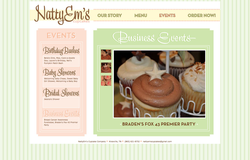
NattyEm's is Live!

NattyEm's Cupcake Company's new website is finally up and running so check it out! And go order some cupcakes if you're in the Knoxville area :) www.nattyemscupcakes.com

Tuesday, November 23, 2010

NattyEm's Website Final

My final project for Digital Page and Web Graphics was to redesign a website of our choice, creating at least 10 pages. I chose NattyEm's Cupcake Company, a small cupcake catering business out of Knoxville, TN which is co-owned by Natalie Thomas, Alexander's sister. The website should be live within the next few weeks, so when it is I'll be sure to post the URL. Below are screenshots of each page. Is it bad that I enjoyed all of this tedious work?


Tuesday, October 26, 2010

HUCK Redesign

Project II for Digital Page- redesign a magazine's cover (including logo), spine, contents page, and the feature spread. I chose Huck magazine, a surf/skate/snow culture magazine published in the UK, and got to learn a little more about Spike Jonze.


Making G's

My first Drawing for Design (draw230) project this quarter was to design two letterforms (uppercase and lowercase) based on the golden proportions with a certain period of art in mind. I made G's based on Optical Art. They're done by hand- yes, I'm insane- in micron pen.


Wednesday, October 13, 2010

NO PATTERN

Last night, Chuck Anderson from No Pattern Design came to do a lecture at SCAD . I was lucky enough to have him sit in on my Digital Page and Web Graphics class earlier that day where he joined in on our magazine redesign critique. As soon as he walked in, we were all surprised about how young he was, and minutes later found out the he never even went to college. As my first classmate showed her work, Chuck confessed that this was the first time that he had ever been in a college classroom, and witnessed a face-to-face crit. "I don't know if I could handle someone dishing out feedback about my work the way you guys do. The only criticism I've ever had to receive has been over the phone". It was incredible to see his talent later that night, doing professional work for a variety of companies such as Absolute Vodka, Burton Snowboards, Bank of America, and Reebok since he was 18. Now Chuck is only 25, and has firmly established himself as a graphic artist in the design industry. Prettttty imspriational! Take a look at his site.

Tuesday, September 28, 2010

Digital Page & Web Graphics: Project 1

Fall quarter finally came, and getting back into a routine feels good. First project for GRDS 243 was to make a simple timeline about anything imaginable. Steering clear from extreme sports, I chose something else I love- COFFEE, specifically Starbucks.

Monday, August 23, 2010

Summer Summon

After thinking that taking the summer off from school and work was a wonderful (yet lazy) idea, I have become overwhelmed with the amount of time on my hands and the time I've been wasting. Don't get me wrong, I've enjoyed my creative hiatus, but it's time to get back in the groove and start a routine before school takes over. For the past couple days, I've been thinking about how much I miss sketching and drawing just for fun instead of for assignments... And since my favorite thing to draw is letters and typography, I decided to start a sketch book of my hand done lettering, completing at least one every day. Since this summer has brought about many, many ridiculous quotes and dumb words, I don't think I'll have any trouble getting started. Tomorrow starts the fun.... no procrastonating allowed.

Tuesday, June 29, 2010

Off Campus New York

From June 4th to the 13th I was in New York City taking a class called Architectural New York. Every day the 7 of us in the class would visit a different neighborhood in Manhattan with our professor, and view some iconic architecture that explains a lot of New York's history. For one of our assignments, we had to make a presentation on a building of our choice in the city, and supplement it with a hand out. Although I had never seen it, I decided to do the New York Public Library and was super impressed when I saw it in person. Here's my handout:


Monday, May 31, 2010

Icon System

Here's my Vector and Raster Graphics class: 20 icons all containing the same theme. I couldn't help but to do snowboarding :)

Wednesday, May 26, 2010

House Industries Catalog

Here's my catalog for Type I. The text inside is the content of my research paper.


House Industries Poster

For my Typography I final project, we were required to research a typographer, write a 1,500 word essay, prepare a 5-10 minute lecture, make an 8 page catalog, and a large poster advertising our lecture. A lot of work! I chose House Industries , and since I LOVE doing things by hand, I decided to hand paint my poster, sticking with the concept of my paper that anything hand done gives it an edge! Here are some progress shots I took on my phone. The poster is 18" x 24" done with acrylic paint on plywood.


FINALS are FINALLY over!!

Just finished printing my last project that is due tomorrow! I feel the weight lifted off of my shoulders already :) I am so happy with how all of my final projects turned out, and SO ready for a little break! I'm uploading pictures of my work right now, so check ittttt

Sunday, May 23, 2010

Sneak Catalog Peak!

Here's a preview of one of my spreads in my 8 page catalog I'm making for my Typography final.... in the process of finishing it up!

Wednesday, May 19, 2010

Photoshop V Card

Sadly the first time I ever used Photoshop was just 8 weeks ago, when I began my Vector and Raster Graphics class. We had to create four collages based on a "micro journey". My journey consisted of different friends jumping on a trampoline. Here's my two favorites.