Monday, May 31, 2010
Icon System
Here's my Vector and Raster Graphics class: 20 icons all containing the same theme. I couldn't help but to do snowboarding :)

Wednesday, May 26, 2010
House Industries Catalog
Here's my catalog for Type I. The text inside is the content of my research paper.


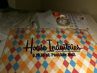
House Industries Poster
For my Typography I final project, we were required to research a typographer, write a 1,500 word essay, prepare a 5-10 minute lecture, make an 8 page catalog, and a large poster advertising our lecture. A lot of work! I chose House Industries , and since I LOVE doing things by hand, I decided to hand paint my poster, sticking with the concept of my paper that anything hand done gives it an edge! Here are some progress shots I took on my phone. The poster is 18" x 24" done with acrylic paint on plywood.


FINALS are FINALLY over!!
Just finished printing my last project that is due tomorrow! I feel the weight lifted off of my shoulders already :) I am so happy with how all of my final projects turned out, and SO ready for a little break! I'm uploading pictures of my work right now, so check ittttt
Sunday, May 23, 2010
Sneak Catalog Peak!
Here's a preview of one of my spreads in my 8 page catalog I'm making for my Typography final.... in the process of finishing it up!


Wednesday, May 19, 2010
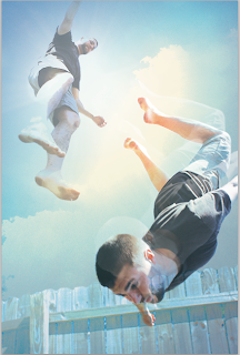
Photoshop V Card
Sadly the first time I ever used Photoshop was just 8 weeks ago, when I began my Vector and Raster Graphics class. We had to create four collages based on a "micro journey". My journey consisted of different friends jumping on a trampoline. Here's my two favorites.


Tuesday, May 18, 2010
Gradient Blending
Here's an exercise I had to complete for today's class to learn about the gradient and blend tools in Illustrator. As much as I dread doing these exercises, I feel like I learn a lot about the software. How corny, right?

My friend Andy decided that aliens would be cool to chill with, but I don't think this one is really my type.

My friend Andy decided that aliens would be cool to chill with, but I don't think this one is really my type.
Saturday, May 15, 2010
Ride Ride Ride
All of these thoughts about snowboarding just won't stop, so here's a line drawing I did last spring of my snowboard :)
 I definitely have my work cut out for me for the rest of the quarter; write a paper, do a presentation, make an 8 page catalog, and 20"x30" poster on a typographer, AND my 20 icons. Not to mention the tests, but bring it on. Check back, I'll post some progress!
 I definitely have my work cut out for me for the rest of the quarter; write a paper, do a presentation, make an 8 page catalog, and 20"x30" poster on a typographer, AND my 20 icons. Not to mention the tests, but bring it on. Check back, I'll post some progress!
Thursday, May 13, 2010
20 Shredcons
New project assigned in Vector and Raster: 20 Icon Set- "create a set of iconic symbols that relate to each other and describe the related group of objects/ideas". The theme I decided on was snowboarding. My icons will cover things from equipment, to terrain park features, to waffles from the Waffle Haus! I've been working on it for the past couple of days, and now I can't get my mind off of snowboarding! Who wants to take a trip to southern Chile? ;)
Wednesday, May 12, 2010
PBD
Got our Type as Syntax exercise back today in Type I... My professor said grades we pretty brutal, but I can't complain about an A-! For the exercise, the class was given two different texts that we were to transform into a well designed article. The article below was my favorite of the two I designed entitled Pale Blue Dot by Carl Sagan.


Tuesday, May 11, 2010
Big Waves, Big lungs
Here's another project I did this quarter for Vector and Raster Graphics. The assignment was to take a magazine headline and manipulate the typography so it "speaks" about the article. I chose Huck Magazine and an article entitled "Big Waves, Big Lungs". The story was about bringing aspects of free diving into surfing in order to conquer bigger waves. For the type, I started out with Minion Pro and messed with it so it would look as if it were filled with air and at the same time have a surfer feel. I also sampled my colors from the image featured in the original article.


AOK Logo
This morning my logotype project was due in my Vector and Raster Graphics class. My friend Wes and I were running around like crazy 20 minutes before class trying to print and mount our pieces, running into all sorts of problems. Once we finally had our projects in our hands, we parked the car and spray mounted them on the side of the road, 10 minutes late for class. Rough morning! Luckily I got great feedback during our critique. The company I chose was All Out Kiteboarding ( check out www.AllOutKiteboarding.com ), since my neighbor John Mapel is the co-owner. 
The sketch I started with...
Final
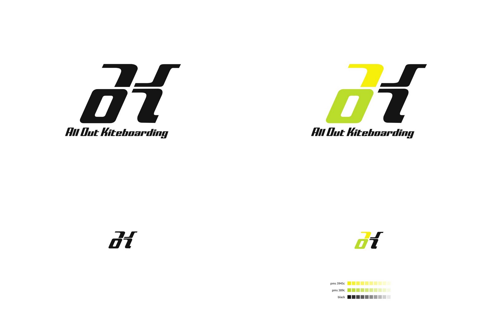
Black/white and 3 color version
Monday, May 10, 2010
Opportunities to Fail
Today my Typography professor handed back all of our assignments that we've done over the quarter, and the room went silent. Grades weren't too awesome, but I did pretty well on our Opportunities in Form exercise. We were to use a couple different fonts he selected to make new, more interesting shapes.


Sunday, May 9, 2010
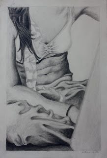
The Hartford Art School
A year ago today- Mother's Day- my mom drove up to Connecticut to move me out of my dorm at University of Hartford... how many mom's would do that?! Even though I transferred to SCAD, my Drawing professor at Hartford really pushed me to become a better artist. Here's a few pieces I did in 2008-2009


The New B
What's happening out there? I am attempting to figure out how I can make this blog be what I want it to be.... which, by the way, is a way to share- and show off ;) -my artwork! So bare with me, I'm doing what I can, and keep checking back with how things are looking! Thanks guys.
Subscribe to:
Posts (Atom)


